Microsoft Word
Why it Matters
Accessible documents benefit everyone, not just individuals using assistive technology (AT). They ensure content can be easily navigated across different browsers and software, improving readability and usability. Accessible Word documents also work more effectively with screen readers and magnifiers, providing equal access to information.
To enhance accessibility in Word documents, follow these best practices:
- Use built-in Styles for headings instead of manually formatting text
- Structure content with bulleted or numbered lists for better readability
- Add alt text to images, graphics, and charts for screen reader users
- Create descriptive hyperlinks instead of using generic text like "click here"
- Ensure sufficient color contrast and avoid using color alone to convey meaning
- Use simple tables with clear headers and avoid merged or complex cell structures
- Check document flow by reviewing it with Adobe Acrobat's accessibility tools
Get Help With Digital Accessibility
Faculty members have several support channels:
- IT Accessibility
- CTE Digital Accessibility website and trainings
- TAMUS CATIE Accessibility & Universal Design for Learning Work Group
- SPH Academic Team consultations
Remediate Word Document
Images meant to convey meaning should contain an alternative or “alt” text description. When a student using a screen reader encounters an image in Word, their screen reader reads the description for them.

Context is everything when deciding upon alt text for your images. Alt text should always align with the subject of your Word document.
See How to Create Accessible Images for more information. Also, there are many writing alt text resources available.
Headings are essential to Word documents because they give your document structure. This hierarchical structure allows students to scan your documents visually or with a screen reader. But scanning only works if the hierarchy is well formed.
You can create headings by using Word’s built-in styles on the ribbon’s Home tab.

For more information, check out our How to Create Accessible Headings tutorial. (In addition, see our well-formed heading hierarchy example.)
Hyperlinks should:
- Be descriptive and meaningful out of context
- Help people know where they’re going
Descriptive hyperlinks give meaning to where the URL in the background will take you. You’ve seen several descriptive hyperlinks already throughout this guide (and yet, no URLs).
Screen reader and keyboard-only users can skip from link to link by pressing the Tab key on their keyboard. Therefore, if links don’t make sense on their own, we’re not providing enough information.
See our How to Create Accessible Links tutorial, where we discuss good and bad hyperlink examples. WebAIM has more to say about links and screen readers, helping you form better descriptive link text.
Contrast
So all students can read your content without difficulty, text and its background color should have sufficient contrast. Be aware of colors that may be problematic for students with color blindness.
You can find insufficient color contrast by using Word’s Accessibility Checker.

The highest and best possible contrast is black text on a white background or white text on a black background. The worst contrast example here is off-white text on a white background.
Additional tools can help you find better colors to use in your documents and web pages. Check out Just Color Picker and WebAIM’s Contrast Checker to help you choose. You may only need to darken your text to find a better contrast ratio.
Use of Color
See our Contrast & Color Accessibility tutorial to see why we shouldn’t use color alone to describe something.
Data tables display information in a grid or matrix. They contain header columns and/or rows that explain what the information in the grid means.
Sighted students can scan tables to make associations between table data and corresponding headers. When you set table properties correctly, table headers provide those associations for students using a screen reader.
Read How to Create Accessible Tables to see how to set up your tables properly.
Spot and Fix Accessibility Issues in Word
Easiest: Add it to your Quick Access Toolbar
The simplest way to repeatedly use the Accessibility Checker is by adding it to your Quick Access Toolbar. If it’s always visible, you’ll remember to use it more often.

Add the Accessibility Checker to your Quick Access Toolbar
Other Ways to Find the Accessibility Checker
There are 3 more ways to find the Accessibility Checker within Microsoft Word, each increasingly more difficult to find:
- At the bottom-left of Word, you’ll see text such as “Accessibility: Good to go” or “Accessibility: Investigate.” Click the text to bring up the Accessibility panel.

Figure 2. Bottom-left text in Microsoft Word – Accessibility: Investigate (It’s good to review the checker regardless of what it states at the bottom-left of Word. Sometimes, issues appear in the checker that haven’t yet triggered “Investigate” to display.)
- In the Review tab, click the icon above the words “Check Accessibility.” Or click “Check Accessibility,” then “Check Accessibility” in the drop-down menu. (Clicking the icon is one less step, thus quicker.)
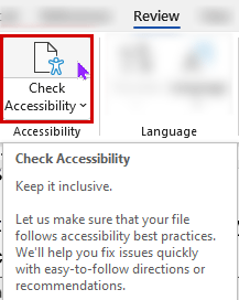
Figure 3. Check Accessibility icon on the Review tab - Go to File > Info > Check for Issues > Check Accessibility to open the Accessibility Checker panel.
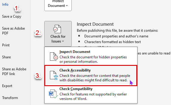
Figure 4. Check for Issues button, then Check Accessibility


It’s best to add the Accessibility Checker to your Quick Access Toolbar to find it quickly and use it often.
Now, let’s see how Word’s Accessibility Checker works!
Open an existing Word document and Word’s Accessibility Checker panel. Accessibility errors and warnings are displayed in the side panel, errors first. (They’re the most important to fix, so they’re prominent.)
This Word document has the following issues:
- 3 images are missing alternative (or “alt”) text
- Merged or split cells exist in a table
- There is insufficient contrast between some text and its background.
Selecting the category (e.g., “Missing Object Description”) toggles the list from expanded to collapsed. All categories are expanded in this image. Collapsing a category allows lets you focus on whatever you’re attempting to fix.
When you click an item within a category, like “Picture 1,” additional information appears below, telling you:
- Why it needs to be fixed
- Steps to fix it
Fixing Accessibility Issues in Microsoft Word
As stated above, clicking an error or warning shows Additional Information to help you fix the problem. At the same time, Word selects the content and moves you to that location in your document. Therefore, you can immediately see the problematic content and start fixing it.
Additionally, Microsoft 365 has added an incredibly helpful feature. Now, when you click an error or warning, you’re also provided recommended actions to fix the problem. We’ll go through a quick example.

After clicking “Picture 1,” we’re brought to the image; it is selected, and the Recommended Actions menu appears. Here, we can bypass any steps listed in the Additional Information section. Clicking “Add a description” or “Mark as decorative” takes us directly to the proper panel to fix the error. (In this case, the “Alt Text” panel appears.)
You don’t even need to read the instructions to see what you need to do! Microsoft Word takes you exactly where you need to go to fix the problem.
Continue working with the Accessibility Checker panel until you’ve fixed all errors and warnings in the checker.
Converting Word Document to PDF
If you plan to convert your Word document to a PDF (e.g., for sharing), add a document title first. Screen readers read this title to students instead of the filename. Accordingly, the document title should be an easy-to-read replacement. (Copy and paste your document’s Heading 1; that would likely suffice.)
Sighted students will see this title instead of the filename on Adobe Reader’s PDF tab. Again, students using a screen reader hear this title instead of the filename. Therefore, this title should be helpful for all your students.
Unfortunately, Word’s Accessibility Checker doesn’t flag a missing document title as an accessibility issue. So, you’ll have to remember on your own, refer to this guide, or be reminded by Canvas upon uploading the PDF. Luckily, you’ll have multiple chances to get it right for your students.
Instructors primarily use PDFs for their students’ online course materials. Regardless of their reasons, there are many benefits to providing PDFs for your students instead of the original document.
Adobe PDFs can be shared, viewed, and printed by anyone on any system using free Adobe Reader software. Regardless of your operating system or the original application used to build the document, anyone can access that PDF. (If it’s accessible, that is.)
Once you’ve fixed all accessibility issues, then you can convert your Word document into an accessible PDF. Please see How to Convert a Word Document into an Accessible PDF for detailed instructions.